Line25 is reader supported. At no cost to you a commission from sponsors may be earned when a purchase is made via links on the site. Learn more
The proportion for Golden Ratio is 1:1.618. It is a mathematical equation that has found its way into design practices as well. The golden ratio has been scientifically proven beautiful. The best example to understand the importance of the Golden Ratio can be traced back to one of the most famous paintings: the Mona Lisa. The painting itself uses the golden ratio.
Some other names for Golden Ratio are The Golden Section, Golden Mean, or the German letter “phi”. It is a useful number that helps create beautiful designs. The way Golden Ratio differs from other design practices is that design generally is led by instinct and creativity. Whereas the Golden Ratio has a different approach. It uses mathematical approaches to transform your images, layouts, typography and many more design practices.
The Fibonacci sequence:
This sequence is the sum of two numbers before it. Greeks tossed this practice. It used to help them form a visual pattern to help with their design. After you’re done, turn the sequence into squares and put them side by side and you’ll create a spiral of rectangles. This is known as the Golden Spiral. What’s amazing is that though this is a mathematical equation, there are a lot of natural instances that show the presence of this concept in their structure as well. Natural calamities, flowers and even shells, everything has a hint of the golden ratio. A Fibonacci sequence would look like 1, 1,2,3,5,8,13, 21.
Golden Ratio in Graphic Design:
Golden Ratio adds structure to design, which otherwise has an expressive nature. An easy hack of applying the golden ratio to any element is multiplying the size of the element by 1.618 for figuring out the size of another element or overlay the Golden Spiral for adjusting their placement. The golden ratio can be used for typography, images and much more.
1.Using Golden Ratio for Typography:
Typography refers to the art or technique of arranging type for making the written language legible, readable and appealing when displayed. Adding hierarchy in your layout adds structure and flow to your design. You can use typography for wedding invitation or also for website layout. At first glance, it might not be possible to imagine any correlation between typography and mathematics. However, typography is a blend of letter forms and mathematical proportions.
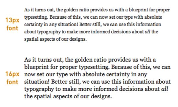
Three factors are crucial to typography; font size, line width and line-height. All these aspects need to be in proportion to each other. By achieving proportion in these three elements, the content you want to put forth would be very appealing to your readers on websites, or even blogs. By tweaking the font size and the content width, you can get an understanding of what the font height should be. A 70-80 CPL-Characters Per Line, is considered comfortable for reading. If the content is too lengthy, the readers would lose out on the natural flow and find it challenging to find the start of the next line.
Golden Ratio can also be of help to have a guide for typography sizes. If you breakdown a three-line text by importance in three sections named A, B and C you’d be able to understand the golden ratio a whole lot better. Suppose C is the least important piece of information you have, and you use the size 10 px for its content. If you need to figure out what size of the text to use for more critical text B multiply the font size of C by 1.618.
2. Adding to the Image Structure:
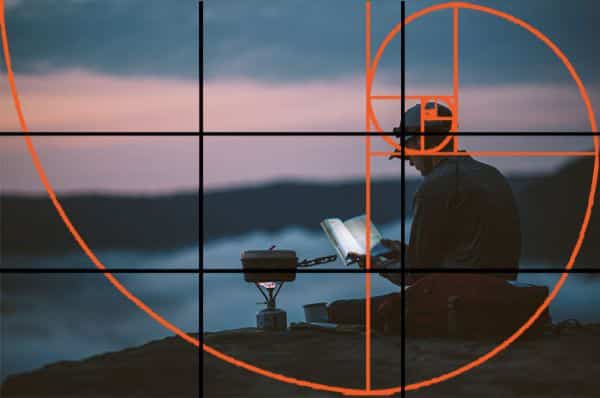
Photographers always have a guiding principle that they use when they click photographs. There are many guiding principles in photography that helps photographers better frame their picture. One such guideline or rule is known as The Rule of Thirds. The rule of thirds essentially is dividing a composition into 9 equal parts, by dividing the frame with two equidistant vertical and horizontal lines. The points where these lines intersect are known as intersection points. The idea of using the rule of one third is that the subject should be placed on the intersection points in a way that the subject only takes up 1/3rd of the frame. This can also be done in post-editing using grid lines. Another such guideline is the Golden Ratio.
Golden Ratio works best when you are trying to create a perfect sense of harmony in your images. Now unlike the rule of thirds, using golden ratio when clicking could be a little trickier, especially when you’re new to the concept. Hence using the Golden Spiral in post-production is one of the best ways to go around it. Overlay the spiral on top of your image. This would help you see which elements of the picture sit where and if they’re creating harmony together. It also allows you to identify focal points and where they need to be. It can also be used to understand which elements need to be moved for giving the design more energy.
3. For creating Logo Design:
Logos are one of the most critical aspects of business identity. It helps new potential customers identify your brand, and old customers to retain your services and products through your logo. A brand logo helps create the first impression of the business’ values and relevance to its audience. It is the first interaction anyone has with a brand as logos are more visual than texts. This is why it is very important to have a great logo that delivers what the brand stands for at its core in a single glance.
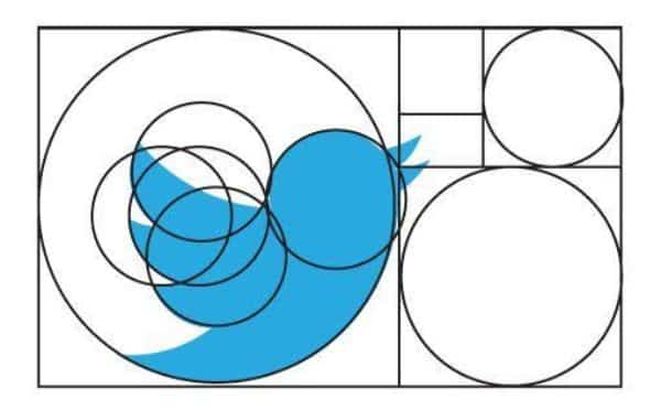
One good practice for creating spectacular logo designs is using the Golden Ratio. Using the Golden Ratio for designing logos help people instantly connect to the brand. An excellent example of this would be how many famous brands like Twitter, Apple, even Pepsi have been using it to design their logo.
You can also make use of the Fibonacci’s Sequence to create logos. Initially, start by creating a circular sequence using the Fibonacci’s Sequence and then rearrange them for forming a grid that would work as the basic framework for your logo design.
4. Golden Ratio and Architecture:
Architecture refers to the art of creating designs for buildings and constructing them as well. Ancient Greek architecture has been using the Golden Ratio to create its beautiful monuments. These monuments always seem to have dimensional relationships between their width and height. The entire building gives a sense of being in perfect proportion. Famous polymath Leonardo da Vinci himself has used the golden ratio to create some appealing compositions in his times. Even the most famous painting The Last Supper the characters are arranged in the lower two-thirds of the golden ratio. Also, the position of Jesus is perfectly placed by arranging golden rectangles throughout the canvas.
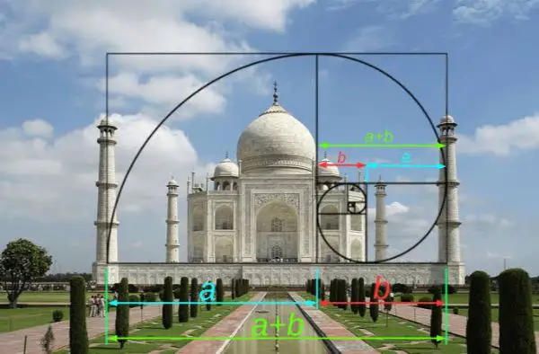
Taj Mahal is known to be one of the Seven Wonders of the World. It also used Golden Ratio for its design. The central building of the Taj Mahal was designed using the Golden Ratio. The rectangles helped create the basic outline for the exteriors of the building, which were all in the Golden Proportion.
Using the golden ratio in architecture helps bring a sense of balance and height to the structure. Any building that seems well balanced naturally draws attention towards it. One of the most simple manners to reflect balance in a building is by using the Golden rectangle principles. Another advantage of using the Golden Ratio is it allows you to create various shapes. You don’t need to stick to box-shaped or rectangular structures. The golden ratio uses those shapes as a base to guide your design. Still, you can easily incorporate various other shapes. You need to make a few changes to the golden rectangle to turn the building into any shape you desire. A few derivatives that architects usually use are the Golden Triangle and a Logarithmic Spiral.
5. Designing and Creating Layouts:
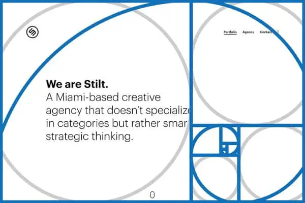
Layouts are the system arrangement of various elements on a page that usually refers to a specific placement on text, image and the style. It is essential to understand layouts because a wrongly worked layout would lead to inaccurate delivery of the message you want to convey. A good layout is essential to convey the message effectively. Not only this but a proper layout would help enhance the look of a particular object individually and also as a whole. Hence for successful layouts, the two criteria that need to be kept in mind are individual visual elements and their relationship.
There are many layout options available to designers. One of them is the “Z” layout which takes inspiration from the letter “Z” itself. It generally shows the path that a reader sees the elements on a page or a design. Another layout principle is the Golden Ratio. Golden Spiral works best when you have many elements that might differ from each other to be arranged in a single layout. It is seen that people are naturally drawn to the centre of the spiral when witnessing a golden spiral. This gives us the insight to place the most important element in the centre of the spiral
6. The presence of Golden Ratio in Human Face:
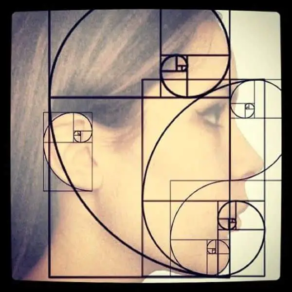
Front face: It is interesting how prevalent the golden ratio is. For understanding its relevance, it is important to realize that even our faces draw from the concept of the golden ratio. The head makes a golden rectangle, and our eyes become the central point. The nose and the mouth are both situated at the right sections of the distance of the chin and eyes.
Side Face: If you look at a human head from the side, it illustrates the Divine Proportion. The first golden section that is at the front of the head defines the ear opening position. Then successive golden sections define different parts of the face, like the neck, the back of the eye, and front of the eye guiding back to the nose and mouth.
The human face has several instances of the divine proportion. The centre of the pupil is proportional to the bottom of the teeth and bottom of the chin. The outer and inner edge of the eye is proportionate to the centre of the nose. Our outer edge of lips complements the outer ridges of lips. The width of the iris is proportional to the width of the iris.
Understanding the Golden Ratio can be very helpful for design practices. It is a mathematical approach to design that stands out from other design practices. It is prevalent in many aspects of life naturally as well. Since it is naturally available in so many instances, we tend to appreciate any design that uses its principles many times without even realizing it. Just remember the constant ratio 1:1.618 and keep using it in different instances and places.