Line25 is reader supported. At no cost to you a commission from sponsors may be earned when a purchase is made via links on the site. Learn more
Other than the design of the home page, checkout page design is probably one of the most critical steps for a web designer. A clean and simple design layout of the page will result in a positive checkout experience for the user. After all, no one likes a confusing and cluttered checkout page, especially if it doesn’t channel the user to the final result which is clicking the “pay now” button.
The more layout pages you design, the better you get at creating good experiences. If you are designing a checkout page, there are many things to consider such as:
- functionality
- usability
- security
- design
To design an effective checkout page, you have to take the time to learn about conversion rate, cart abandonment, billing information, and many other factors. The checkout page is about numbers, profit, and sales. So, it cannot be designed as an afterthought as it is one of the most important pages in the online shopping experience.
To create a positive online checkout page experience, you have to be able to create a digital environment that can improve the income growth of a particular business. We have gathered some important suggestions for you to consider regarding the important design elements of a checkout page.
3 Checkout Page Design Tips For Web Designers
Checkout page design elements should consist of some fundamental pieces so it’s good to understand why. Here are 3 top tips to help with understanding why the design structure of a checkout page is critical to the success of the eCommerce site:
1. Study the audience
It is important to keep in mind that you are not designing the page for your client but for customers who will be using their product or services. So take the time to learn and understand the audience. So when you set up a meeting with your client, make sure to ask him necessary questions like
- Who is your target user?
- What is the cart abandonment rate?
- What are their needs?
- What are some of the problems they have encountered so far?
Once you are able to understand the goals of the company, you will find yourself designing an effective checkout page that is well aligned with the voice and values of the business.
2. Functionality
As a designer, you are not just responsible for creating the layout and other elements of the page but also for the overall functionality of the design. Here are some important points to consider
- Provide a progress status indicator on the top of the form. This lets the users know where they are in the checkout process, so they are able to make informed decisions while shopping for a product. Try not to break the process by inserting a required form in the middle of it. This breaks the smooth and linear process of the overall shopping experience.
- Don’t use the update button to modify the value. Give the freedom for the customers to adjust things in their cart without having to refresh the entire page.
- Display the gross price of every product they purchase from the start. This will help bring more clarity to the purchase and help eliminate any unwanted frustrations that may arise later on.
- Design for the smallest screen. When designing for mobile, you will be working with the most essential features of the design. It is easier to scale your designs to a larger screen once you have worked out a way to fit the content into a mobile screen
- Show descriptive texts as much as you can. Most users are often confused about the data entry so having your descriptive texts can help them complete the form with ease.
- Include country-specific payment options. This means that by offering local payment options relevant to the countries they reside in, you are widening your customer base.
3. Visuals
It is important to make the checkout page of an e-commerce website visually appealing. It is also important to remember to design it in a way that remains consistent with the rest of the site. This establishes consistency and helps with brand credibility.
A Good Checkout Page Design Example:
Here’s an example of a good-looking checkout page template design from Envato Elements:
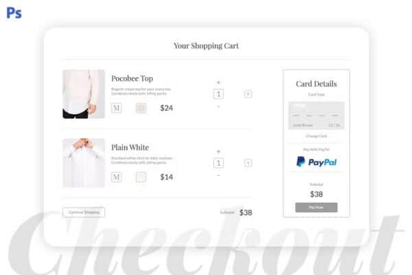
This example is clean and focused with the most important aspects of the product and payment options being clearly visible.
Now, let us take a look at some of the essential elements that need to be on the page.
- Use high-quality images that catch the eye of the user. It should also be accompanied by an icon and descriptive text that lets the user know what they are buying.
- Incorporate the main logo on the page. This way the users are able to click on it to find their way back to the home page.
- Call-to-action buttons like ‘Add to Cart ‘Update Cart’ and ‘Buy Now’ should be designed in a way to grab attention. This means that you would have to play with the text, colors, and shapes to make them stand out on the page.
- It is okay to use color on your checkout page but be sure to keep it consistent with the colors of the rest of the site.
- Typography – It is advised to use simple text to make the content more readable. Novelty fonts are harder to read, so stick to sans serifs for readability and legibility of the text.
- Consider making the product images bigger. This allows their users to take one last look at an image to check the color, sizing, and other details. If the user has to go all the way back to the main page to check or modify these details, cart abandonment rates are bound to increase. Using a hover functionality can help in this area as well.
- Organize the information you have inside tables with precision. Having each product displayed vertically within the box can help you take a look at all the items on a page without having to move across screens.
- Add payment logos and security seals to your checkout page. Including these visuals next to the payment options reinforces the idea as a visual cue for the users and helps eliminate any confusion when making the purchase.
Conclusion
When designing a checkout page, it is important to focus on usability. The key is to keep it simple. If you design a page with organized content and visuals that are able to engage the user you are increasing your chances of it being effective. Running A/B tests is another way to figure out how it performs against its competitors. Strive to design a page that has engaging visuals, organized content, reassuring icons, and descriptive text that can guide and promote sales.