Line25 is reader supported. At no cost to you a commission from sponsors may be earned when a purchase is made via links on the site. Learn more
Because the showcase of responsive website designs proved pretty popular, we decided to revisit the topic and look at some super handy responsive web design articles, tutorials, and guides that will help you get started with @media queries in order to create your own responsive or adaptive web designs. The resources in this collection have been hand picked as the best the web currently has to offer.
Recap: What is responsive web design?
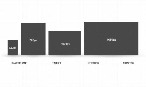
Creating a website that is responsive essentially means the design of that particular website will ‘respond’ according to the medium that is being used to view it. We’re probably all familiar with the battle of designing fluid websites for various browsers back in the days of table based design, in these modern times we also have a range of devices such as smartphones and tablets which all add different resolutions and even orientations into the mix.
A responsive web design will usually use CSS @media queries to style the page according to specific rules, such as min-width. Check out the recent showcase of responsive web designs to see how some of the best designers are styling their content for various resolutions and devices.
Responsive web design articles
Responsive Web Design: What It Is and How To Use It
This in-depth overview of responsive web design over on Smashing Magazine is probably the best place to go to get the basics on what responsive web design is and how it can be used. The post talks about the theory gives plenty of handy code samples and lists a useful showcase of responsive web design.
Intro to Media Queries
This article will tell you everything you need to know about Media Queries using illustrations and explained examples. Check out this articles and find out more about how to use them in a responsive web design.
Adaptive layouts with media queries
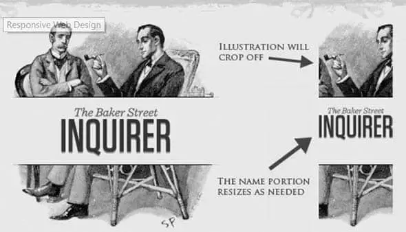
Creativebloq offers some insightful info on the history of responsive or adaptive website designs and the introduction of the media query module along with tips on how to implement such features yourself. The post uses Simon Collison’s beautiful website as an example and focuses on design for iPhone and iPad in particular.
A List Apart: Responsive Web Design
If there’s one place on the web you should go to get the full ‘low-down’ on any web related topic, A List Apart is that place. Needless to say, this article on A List Apart digs deep into the theory of responsive web design and gives technical code examples from a custom build demo website.
Understanding the Elements of Responsive Web Design
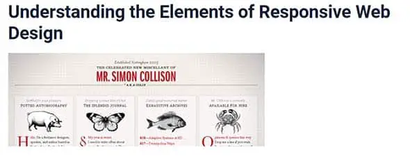
Six Revisions takes a look at what responsive web design actually is and helps us understand the individual factors that make a website truly responsive. The articles talk about flexible grids, scalable images and media queries with a conclusion asking if we’re really ready for responsive web design as a solution to our cross browser and cross device problem.
Responsive web design tutorials
Setting The Viewport
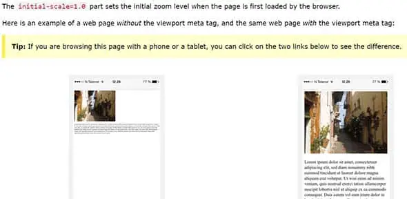
Viewports are important in responsive web design tutorials. At the beginning, web pages were built so they could a computer screen but now that we use, more and more, tablets and smartphones to surf the internet we have to rethink the way we design pages.
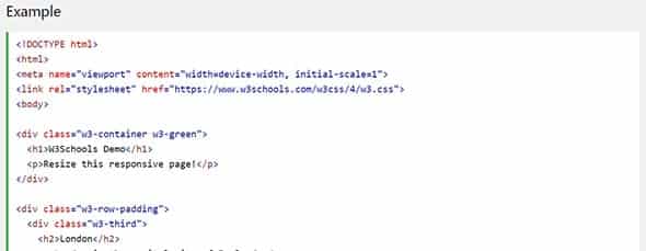
Responsive Web Design – Grid-View
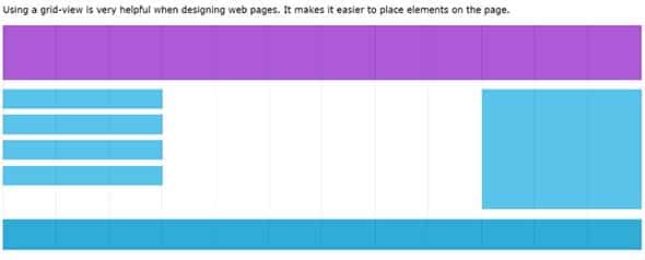
Pages are actually divided into columns which is why understanding Grid Views is important. Have a look at this tutorial and learn how to build a responsive grid view.
Responsive Web Design – Images
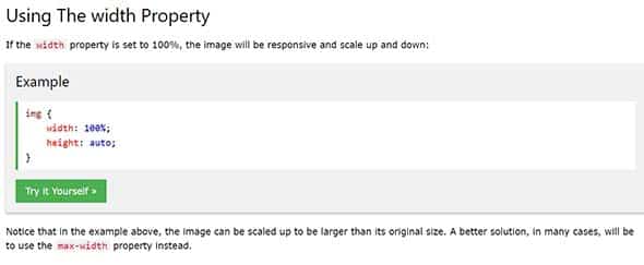
Learn how to make your images scalable so that they could resize depending on the device you’re using.
Responsive Web Design – Videos
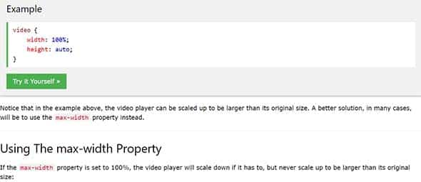
Now that you’ve learned how to make pictures scalable to fit any screen, you might want to learn doing the same for videos.
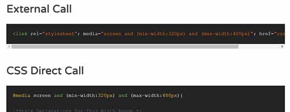
Responsive Web Design – Media Queries
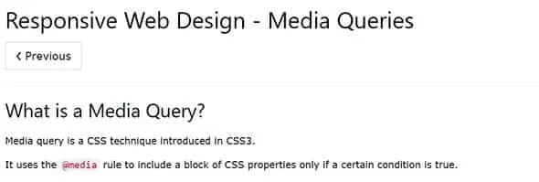
A media query is a CSS technique introduced in CSS3 and this great, step by step tutorial, will teach you everything about it, from adding breakpoints where some parts of the design will behave differently, to changing the layout of a page depending on the orientation of the browser.
How to use CSS3 Orientation Media Queries
1stWebDesigner has some fun with CSS3 media queries to show what kind of effects can be produced. See how the orientation media query, in particular, can be used to change the color of an image based on the orientation of the device or browser.
Responsive Web Design – Frameworks
Find out what different frameworks are and how you could use them for making a responsive website.
Responsive Email Design
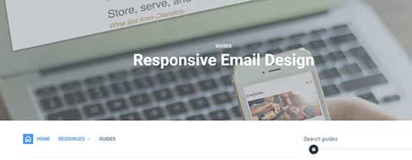
What about responsive web design when it comes to email newsletter campaigns? Campaign Monitor is on the ball with this blog post giving a guide into responsive email design. In this guide, you’ll learn about the principles of designing for mobile and also cover the fundamentals of designing and building a mobile-friendly email, plus its benefits and some neat tips and techniques.
Responsive Web Design Tutorial
This a very detailed tutorial about responsive web design and will teach you some tricks to code it up in no time.
Comments are closed.