Line25 is reader supported. At no cost to you a commission from sponsors may be earned when a purchase is made via links on the site. Learn more
Love them or hate them, horizontally scrolling websites are scattered around the net, and there are some fantastic examples. Unlike the traditional layout of a website that scrolls up and down, horizontal websites flip things around and scroll from left to right. Sometimes they’re enhanced with Javascript to offer an even richer user experience, such as auto-scrolling effects. Check out this collection of 30 inspiring examples, and follow on to a hand full of brilliant tutorials that give an insight into the theory and practice of creating a horizontal site of your own.
The usability of such sites is often questioned, but I personally think they’re great, although one important factor I’d advise considering is to tap into the user’s mouse scroll wheel to enable it to scroll the website horizontally. This is a technique employed by a bunch of the sites in this showcase, and as you’ll find when browsing, it makes them much more usable.
Elfletterig
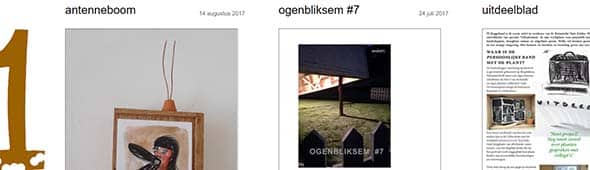
Elfletterig is a horizontal website that uses navigation keys to scroll from left to right. It has a lot of content and images displayed in a unique layout.
Jason Love
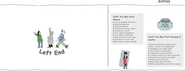
This is Jason Love’s creative horizontal scrolling website. He presents a story with 2 ends with a lot of illustrations along the way
Magpie-studio

Magpie-studio has an interesting way of presenting content to their readers. They have a one-page website made of horizontal images that slide as you click them.
Zand.tech

Zand uses animation and a horizontal scrolling layout for their website. They’re a UX team who love design and are focused on finding the best solutions for their clients.
Norgram
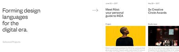
Norgam focuses on forming design language for the digital era that we’re in. They have a horizontal scrolling website that showcases all their projects.
Archidirectors

This horizontal website is dedicated to the work of the contemporary illustrator, Frederico Babina. You can scroll through a gallery of impressive artwork while listening to a carefully picked soundtrack.
Bbb.cat
This website has a minimalist yet unique design. They focus on presenting key information about themselves and their work.
Posta

Buildinamsterdam

This horizontal website works as a design and development agency’s portfolio and it stands out with a creative and unique design.
Identityprint

This is yet another good example of a horizontal website that focuses on print related content and uses the navigation keys to scroll left and right.
Studionewwork

This website also uses navigation keys to scroll through their content. They have a nice gallery of projects that can serve as good inspiration.
We Shoot Bottles

This website gives you the impression that you’re reading a book or a flier. They’re specialized in bottles which they photograph at a price that makes everyone happy of their investment.
Magic Realism
Magic Realism also uses a horizontal website on which they post content in a good looking minimalist way, similar to an image gallery.
Neu-e
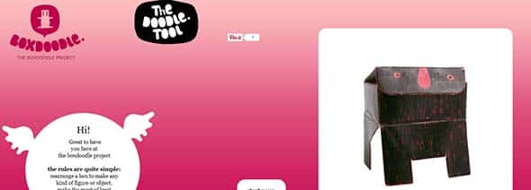
Neu-e is a horizontal website that encourages their readers to make something out of an ordinary box. The results are very nice and each object is posted on their page.
Zupadupa
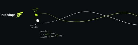
Zupadupa is a web agency from Cluj, Romania and they have a horizontal scrolling website that uses a minimalist design.
Hipstamatic

Hipstamatic uses both vertical and horizontal navigation on their website. They have a creative way of posting content especially through animations, pictures and typography.
Thehorizontalway
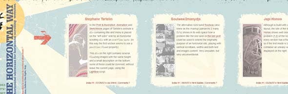
The horizontal way, as their name implies, is a project that aims to showcase a list of horizontal websites like their own one.
Movement of Data
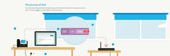
This is another example of an interactive horizontal website that focuses on sharing a story about the movement of data and how it became what it is today.
Vitamins Kids

Alex Flueras

This website has a horizontal layout that uses navigation key to scroll through a gallery of photos taken by Alex Flueras.
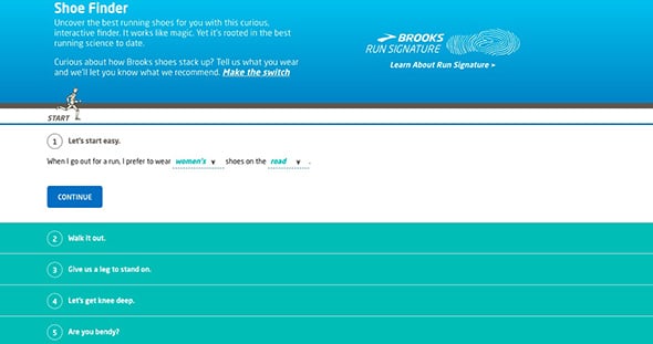
Brooks
Assets.wwf.org.uk

This is yet another interactive horizontal website that focuses on raising awareness about what we eat, how we produce it and how we could protect our planet and our most iconic species.
LoveBento
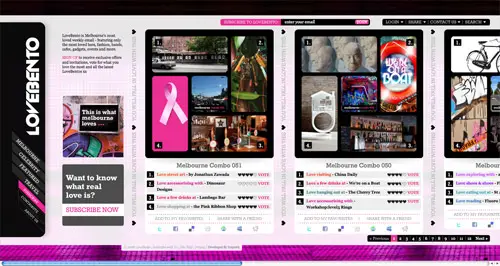
LoveBento’s aim is to showcase through their horizontally scrolling website some of most loved stuff in around the world, such as music albums.
25-years-of-the-internet
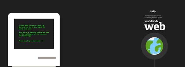
25 years of internet tells the story of internet starting with the first proposal in 1989 to nowadays using a horizontal layout and an interactive way of presenting content.
Chesterzoo.org/memories

Chester Zoological Society shares their story, starting from 1930 to nowadays through a horizontal scrolling layout on their page.
Lucuma

Lucuma uses a more minimalist design that only has a horizontal scrolling galleries.
Hasrimy

Hasrimy specialize in web design and they don’t only think outside the box but also outside of this world. They use a horizontal layout for their website on which you can scroll to find out more about themselves.
Archi-graphi.fr

This website focuses on presenting architecture projects from France in a horizontal scrolling website. The images are showcased on a grid layout, very frequently used in portfolios.
Dean Oakley
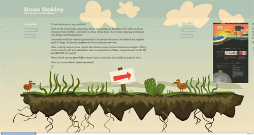
Last but not least, Dean Oakley’s website is yet another example of using horizontal scrolling in a user-friendly manner.
BONUS: How to Create Your Own Horizontally Scrolling Website
Fancy building a horizontal site of your own? Check out these handy articles and tutorials. Each one offers expert advice on the coding techniques used, and the best practices when considering going the horizontal way.
Smooth horizontal scrolling
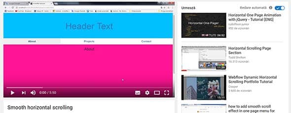
This first example might come in really handy if you’re considering making a horizontal page. From this video, you’ll learn how to make a smooth horizontal scrolling page using Bootstrap and some jQuery magic.
Vertical and Horizontal Scrolling with fullPage.js
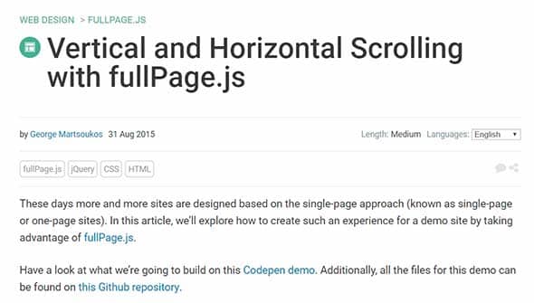
From this article, you’ll learn a lot of new techniques about making a vertical and horizontal scrolling website using fullPage.js.
Horizontal Scrolling Portfolio Tutorial
The next example is another video tutorial, which will help you learn how to make a webflow dynamic horizontal scrolling portfolio.
How TO – Horizontal Scroll Menu
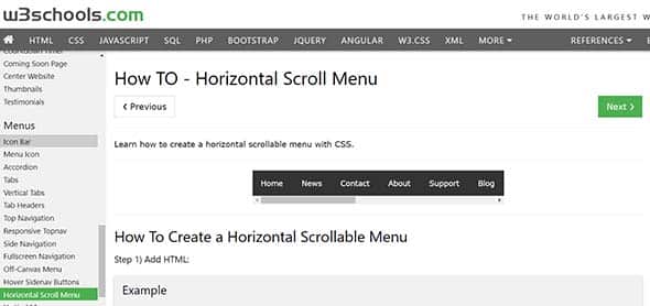
This is yet another helpful tutorial from w3schools which will teach how to code and create a horizontal scrollable menu with CSS.
Comments are closed.