Line25 is reader supported. At no cost to you a commission from sponsors may be earned when a purchase is made via links on the site. Learn more
While getting loyal customers to your website is a real struggle, here is a brand new way to boost sales and get a loyal base. Want to hear the trick? It’s your Error 404 page! Isn’t it a bit of a shocker that an error page could turn into a real-time show stopper? We have listed some instrumental and well-designed Error 404 pages, which have definitely turned out to be as stunning and relative as the website itself. But first, let’s understand what an Error 404 page is.
What is Error 404?
There are various reasons for this page to pop-up on your screen. It could be due to the deleted links or removed/updated content on the website. It could also be due to altered permalinks according to the changes in topics or headings. Usually, an error 404- page can be a visual break to the website’s working, which can reduce the user experience. This, in return, also diminishes your loyal customers or people who are genuinely interested in your product.
Creative Error 404 pages are a great way to keep your clients or customers engaged. The 404 pages can communicate great details about the brand, and work wonders if it subtly addresses the supposed interests of your customers. To help you with such interesting ideas, here are a few fun and highly creative Error 404 pages that can hit the right spot for your customers!
1. Lego – ‘Page Not Found’ friendly design:
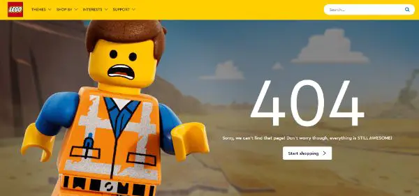
Lego is well-known for its branding and product. Lego’s 404-page is an excellent example of reinforcing your brand with a subtle message that is an approved way to keep your audience engaged. The strategy that the Lego designers used is that they used common phrases that anybody could understand – such as ‘Sorry, we can’t find the page. Don’t worry, though, everything is STILL AWESOME!’, as opposed to techy phrases such as – Error 404!
Not only does this make the customers understand that simply the page was not found, but also keeps them involved with the imagery, rather than exiting the website.
2. List25 – Options on the 404 Page:
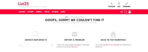
List25 gives a significant advantage over some other 404-pages; it allows you to search, report a problem, and go back to the homepage. Sometimes, you might misspell the name of the topic/page, which might get you to the 404-pages. In this case, you can quickly type out again in the given search drop-down. Otherwise, you also have a ready option to report a problem and get in touch with the officials directly. This technique not only guarantees trust over the brand but also challenges a better service, as compared to other competitor brands.
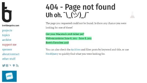
3. Brett Terpstra – Simple 404 Page Designs:
 a
a
Not all the brands can ace a simple 404-page design; most people end up overdoing it with regards to the quirks. Brett Terpstra’s simple 404 design makes the brand look charming, quirky, and well-aligned with its identity. The strategy that the designers used is suggesting similar page links right in below the error box that can take you to closely related pages. The result is two-fold: The customers might find the information in the suggested links. If not that, they would still click on one of the links due to curiosity. This retains the user’s interest, and they do not exit the website due to the error.
To ace this method, you can use Google’s Custom Search API that calls the best matches to the searched keywords. This shall give the customers an immediate answer to their 404 error page. This also requires Google’s Developer Console, which is a trivial task, but you can find tutorials that can help you.
4. 9Gag – Download Our App:
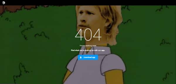
9Gag is fun, meme website which has only one primary purpose – download their app! It is a fantastic way to reinforce the download strategy, and at the same time, the gif that plays in the background is an excellent touch of the brand’s style. One of the main features that attract people and conveys the message easily is the minimal design display. You must keep in mind that the user must not be overwhelmed with too many options.
You should give a maximum of two calls to action options to keep the customers in a well-rounded circuit within your website. There are always potential chances of losing customers if you happen to give too many options all at once!
5. IMDB – Quirky 404 Page:
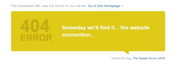
What could be more on-point than this 404-page? IMDB is a movie review website, and it does so in the most quirky ways possible. Their 404-page showcases a quirky quote from one of the listed movies and gives you the option to visit the movie’s page or go back to the homepage. It is a great way to reinforce your brand and at the same time, have fun with the elements that constitute your brand – in this case, the movies.
It is essential to maintain brand familiarity, such that the people who visit your page do not forget the brand’s identity. Even if the movie quotes show up, they cannot be irrelevant to the brand or the page, as that is one of the most annoying things that can drive away customers.
6. Marvel – The Ultimate SuperHero 404:
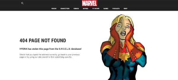
Marvel is the ultimate superhero franchise and a home to all the fantastic comical graphic content out there. The website translates this amazing feature onto their 404-pages, too, and ensures that every time you refresh, new quirky illustrations come up. Made for hardcore fans, the 404-page is an absolute extension of the website that draws every fact into a quirky quote and makes the page look stunning while doing so!
In case you plan on making multiple 404-pages such as Marvel, you must make sure that the content is fresh, quirky, and captivating. It must be relative to the error page and, at the same time, to your brand’s identity. This combination is sure to bag you some loyal customers!
7. Omelet – This page is Eggstinct:
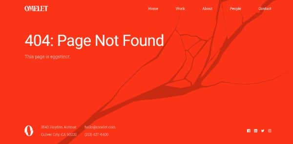
Omelet is a creative ad agency that very rightly uses its brand name and channels into almost every aspect of the website, including the 404-pages. When you land on the error page, an animated crack takes over the screen, which ends up displaying the message ‘this page is eggstinct.’ It is a great way to notify the customer about the error, but at the same time, it is a quirky approach that engages the customer as well. Well oriented with the color theme and the graphic style of the brand, it also follows an authentic and creative approach to the error page.
8. Mantra Labs – Back Home In:
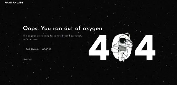
Mantra Labs has come up with amazingly interactive and quite creative 404-pages. When you land on the error page, it first shows an animation of a power bar that opens into the error screen. However, the page displays a fantastic message – ‘Oops, you ran out of Oxygen!’ This is very well oriented with the brand’s aesthetic, the identity of the brand, and the products. What’s more? Once the timer that says ‘Back Home In… 00:10s’ runs out, the website is automatically redirected to the homepage.
This ensures that the customers retain their interests; more importantly, it is a creative strategy to reinforce the brand over the customers. You should have interactive 404-pages if you are willing to sell a product or an innovative service.
9. Ueno – Interactive 404:
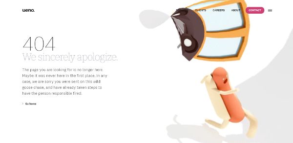
What’s stunning about the Ueno 404-page is that the hotdog keeps running in an infinite loop, passing through some surreal landscapes on the way. You can move the hotdog with the help of your cursor. The image does no justice to the effort involved in creating this masterpiece, so you must visit the page and check it out for yourself! Several messages come up upon refreshing, and that is just an added benefit to the layout and the animation. It is a great way to keep your audience involved, and at the same time, make it relevant to the problem.
10. GymBox – Simple yet effective 404:
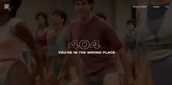
What’s not to love about this amazing 404-page! As the name suggests, Gymbox is a digital gym platform based in London, which helps you register for classes and trainings related to your health choices. The 404-page is a quirky edit that showcases a gif of a gym class group in the loop, with a message that says, ‘You’re in the wrong place.’ The fun part is the simple approach to the design, with bold typography to highlight the error, but simultaneously make it less catchy than the message and gif itself.
This tactic makes sure that even though the page is faulty, you’re hooked onto the quirky background and find it funny enough to stay on the page or explore the rest of the website.
11. Slack – Amazing Design:
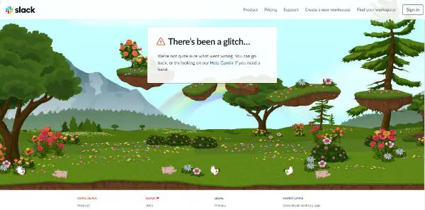
After the update of the Slack logo in 2019, there were many changes and additions to the website, including this super-saccharine new 404-page. You can see a panoramic Ethiopian landscape with rainbows, butterflies, tiny chicken, and pigs roaming about the foliage. Another exciting feature is that you can move to the right or left with your cursor’s help. It is an excellent idea for a captivating 404- page. However, it is a little off from the brand’s concept.
But what makes everything work perfect for this page, is the execution of it. The message displayed – ‘There’s been a glitch..’ definitely justifies the random Ethiopian environment in the background. So make sure that the title and the display that you chose must be well synchronized.
12. Pixar – Aww, Don’t Cry!
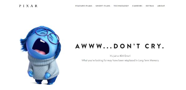
As we all know, Pixar is one of the best animation company’s in the entire world. With numerous hit movies, it only fits to see a familiar face and phrase on the 404-pages to relate it with the brand. Pixar does this amazingly with a simple image of Sadness, a character from Inside Out. However, the best part is also the quote beneath, that says – ‘What you’re looking for, may have been misplaced in the Long Term Memory’- a super relative quote from the movie that also goes well with the error page.
These were a few examples of creative 404-pages that can help you create stunning and interactive layouts for your error pages. It might be overwhelming to see how all these famous brands have specific hooks or critical points used to create an interactive 404-page. But you can always induce elements or pick and chose from your products and services to make your 404-pages stand out as well. You should make sure that the items you select are either the USP of the website, or the most selling commodity/service/product available on your page. This reinforces your services on the customers’ minds and create a brand image that can help you grab some loyalty from their side.
404-Pages are often ignored, or set to the default style, or given the least of attention. But you must not forget that even if it is a mere error page, it still should shout out your brand’s image and identity. You must understand that a creative 404-page is a branding strategy that can help you get loyal customers and create a massive name for your brand!